A Monsters and Dames Process:
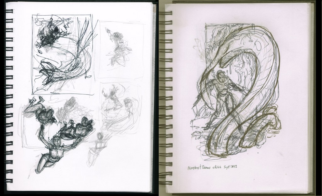
Thought I might walk through my process as I came to create my Monsters and Dames piece for this year’s Emerald City Comicon. The first challenge for me in creating a single, stand-alone image with a fairly wide-open concept is to settle on a basic idea and design. In this case, my first thought was to have Mercy in mid-air, about to square off with some flying beastie. This appealed initially because it was a very different image than last year’s illustration, which was set in the confining space of a creepy sci-fi laboratory. So, I started with some very spontaneous sketches of a rough comp of Mercy and a twisting, dragon-like monster, and some doodles of possible poses of Mercy in mid-air. The idea with these is simply to get the pencil flowing and see what sparks come to fire.
Ultimately, I decided to stick to something slightly less high-fantasy in feel, and put Mercy instead in a swampy setting. It seemed more in keeping with the “rules” I try to play by with Trekker, and it immediately sparked an idea for a swamp-dwelling critter for her to square off with. So I penciled another quick rough in the sketchbook. When I had the composition to the point where the basic elements worked to me, positioning the various elements to lead the eye where I wanted it to go, framing the threatened but coiled-for-action Mercy by the S-curve shape of the swamp creature, blocking in enough background details to set the scene without distracting from the drama of the confrontation and so on, I took out my best sketching friend, a black NIJI Stylist marker, and “inked” over the loose pencil rough to sharpen and finalize some of the details. The above two images are scanned from my 7″ X 10″ sketch book.
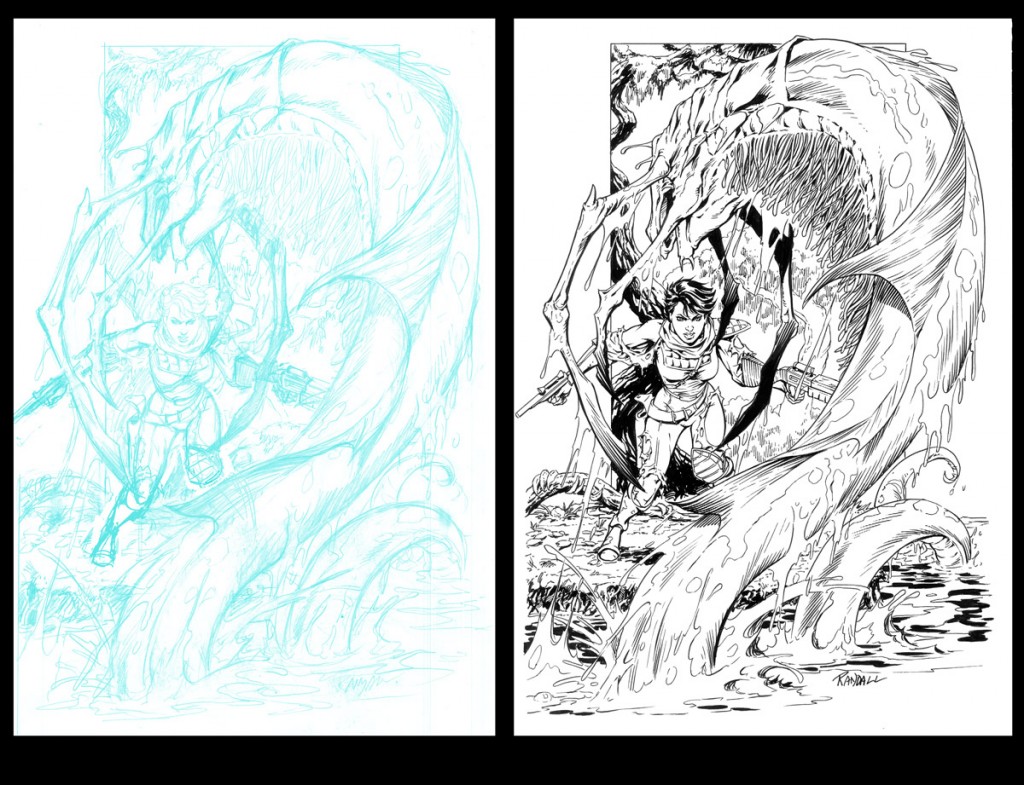
Next. I scanned the sketch into my computer and enlarged it to a full-size 11″ X 17″ image. And on my Cintiq (a stylist-activated drawing screen), I worked over the rough, tightening it at this larger size and fleshing out more details, although at this “rough” stage I was still more concerned with basic elements and compositional concerns than with finish and detail. That happened at the next step, where I printed layout onto paper (as a blueline print– see below) and refined it as a finished pencil drawing. Here I had some crucial choices to add interest and menace to the monster with the fins on its back and the claws, replacing the original ‘fin-arm’ idea.
Next, I scanned the pencil drawing back into the computer, converted all the grey pencil lines into a light blue, and then printed it out onto high-quality drawing paper, Bristol board, for the inks. This is the blueline print above. In earlier days I would simple have inked directly over the pencils. But I like the clean look of the inks over the printed blue lines better– I feel I can see the ink lines that I am putting down more clearly than over my often loose and scratchy pencil lines. And, when the art is scanned back into the computer, the blue lines can be easily removed digitally, leaving a crisp, black and white image. During the pencil stage, I make most of the decisions for details, textures and so forth. But the pencil cannot do what a good brush (I have always got the best results with the Winsor-Newton series 7 number 2 or 3 brush) or good, responsive and flexible markers and brush-markers can as far as range and quality of lines. So when I ink a piece, I am always “interpreting” the pencils, adding line weights, creating patterns of texture and value that can happen spontaneously with a brush but are labored and stiff when done with a pencil. You can see examples above in the textures on the tree in the background, the shimmery linework on the monster, and the thick, dark water. The ink stage is where I look to have some fun with rendering surface and texture, playing with shadows and line weights. But these are the final touches, and always have to come after the careful work of composition and construction.
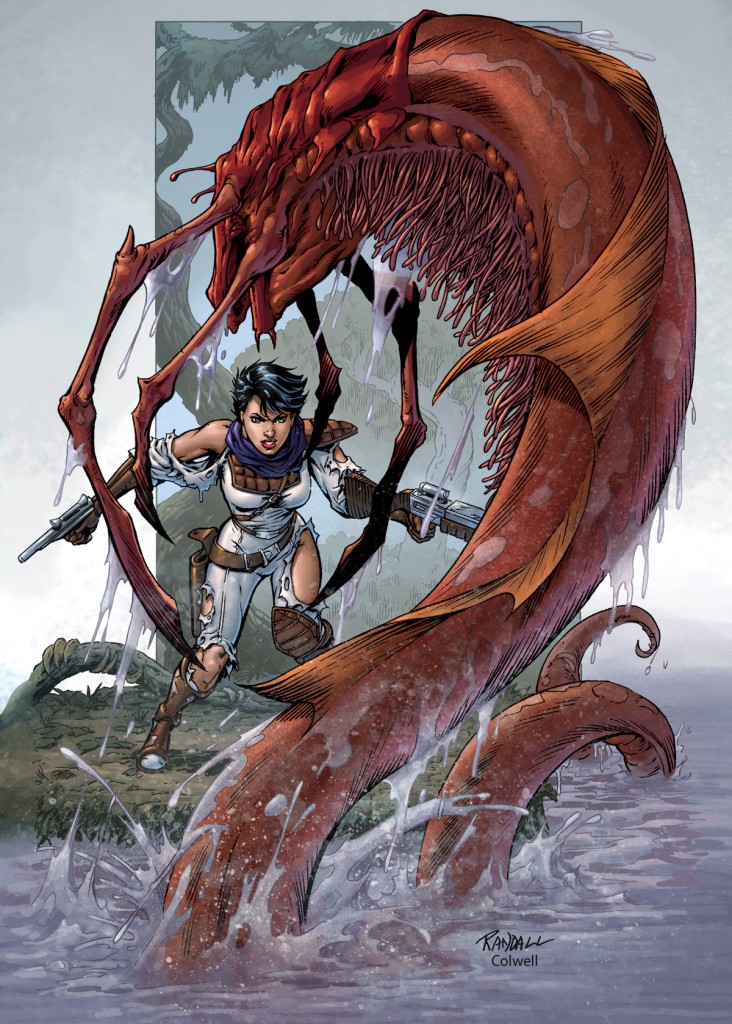
The final stage for me came when I then handed the piece over to ace color artist Jeremy Colwell for his magic. From our earlier work together on Trekker pieces, Jeremy knows my sensibility leans toward a translucent, watercolor-y finish, and a textural, painterly feel as opposed to a slick, overtly digital look. So, the only guidelines I sent to him for this piece was the request to “make the foreground critter red”. With that, Jeremy went to town and did this masterful finish. I couldn’t be more thrilled with the results.







 AL WILLIAMSON
 JEREMY COLWELL
 JOE KUBERT
 MARK SCHULTZ
 PAUL CHADWICK
 PERISCOPE STUDIO
 RonRandall.com
 THOMAS YEATES
 FAMILY MAN
 MAD GENIUS COMICS
 PERILS ON PLANET X
 QUANTUM VIBE
 THE LAST DIPLOMAT
 THRILLBENT
 TRANSPOSE OPERATOR
Comments are closed.