Trekker #1 Revisited
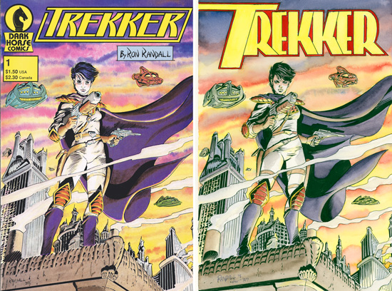 I just completed a very fun, somewhat challenging commission for a loyal Trekker fan. I was asked to “re-create” the cover of the first issue of Trekker, a work I had originally done for Dark Horse back in 1987. Other than the fan’s request that I include the terrific logo that John Workman came up with to replace the original one, the only changes I made were small ones– though perhaps interesting for those who like to peer closely. Small details in figure construction, a more subtle use of watercolor , simplifying the rendering a bit to more closely match the finish I go for these days– bolder and cleaner than back when I launched the series.
 I took several snapshots as I worked through the many steps in the process– pencils, inks, transfers, masks, and the many color steps. Those are all gathered on my Patreon Page. If you are interested in tracing the evolution of the piece, and in giving a little on-going support to Trekker, you can check it all out here. Thanks!









 AL WILLIAMSON
 JEREMY COLWELL
 JOE KUBERT
 MARK SCHULTZ
 PAUL CHADWICK
 PERISCOPE STUDIO
 RonRandall.com
 THOMAS YEATES
 FAMILY MAN
 MAD GENIUS COMICS
 PERILS ON PLANET X
 QUANTUM VIBE
 THE LAST DIPLOMAT
 THRILLBENT
 TRANSPOSE OPERATOR
Interesting to see the slight change in your style. I have to say, I prefer the current way you draw Mercy’s face over the older style. She almost looks too “young” on the original cover; her current look is a little more “mature”, if you know what I mean. Anyway, she looks great. I recently got ahold of a full set of “Conquerors of the Barren Earth” (I’d read the Warlord backups before, but nothing after that), so I’m looking forward to seeing how that story turned out!
Thanks, Mike. Glad you like the little evolutionary steps I’ve taken over time. I guess that’s part of an artist’s journey. Hope you find the Barren Earth miniseries to your liking. I thought Gary wrote a smart and fairly daring tale, particularly for the time. I sure had a great time working on that series, especially as it came so early in my career. That was a pretty good stroke of fortune.