Somewhat Fewer Than Fifty Shades of Gray
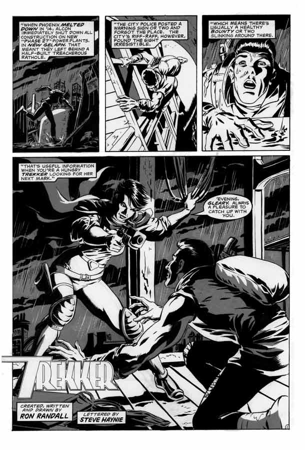
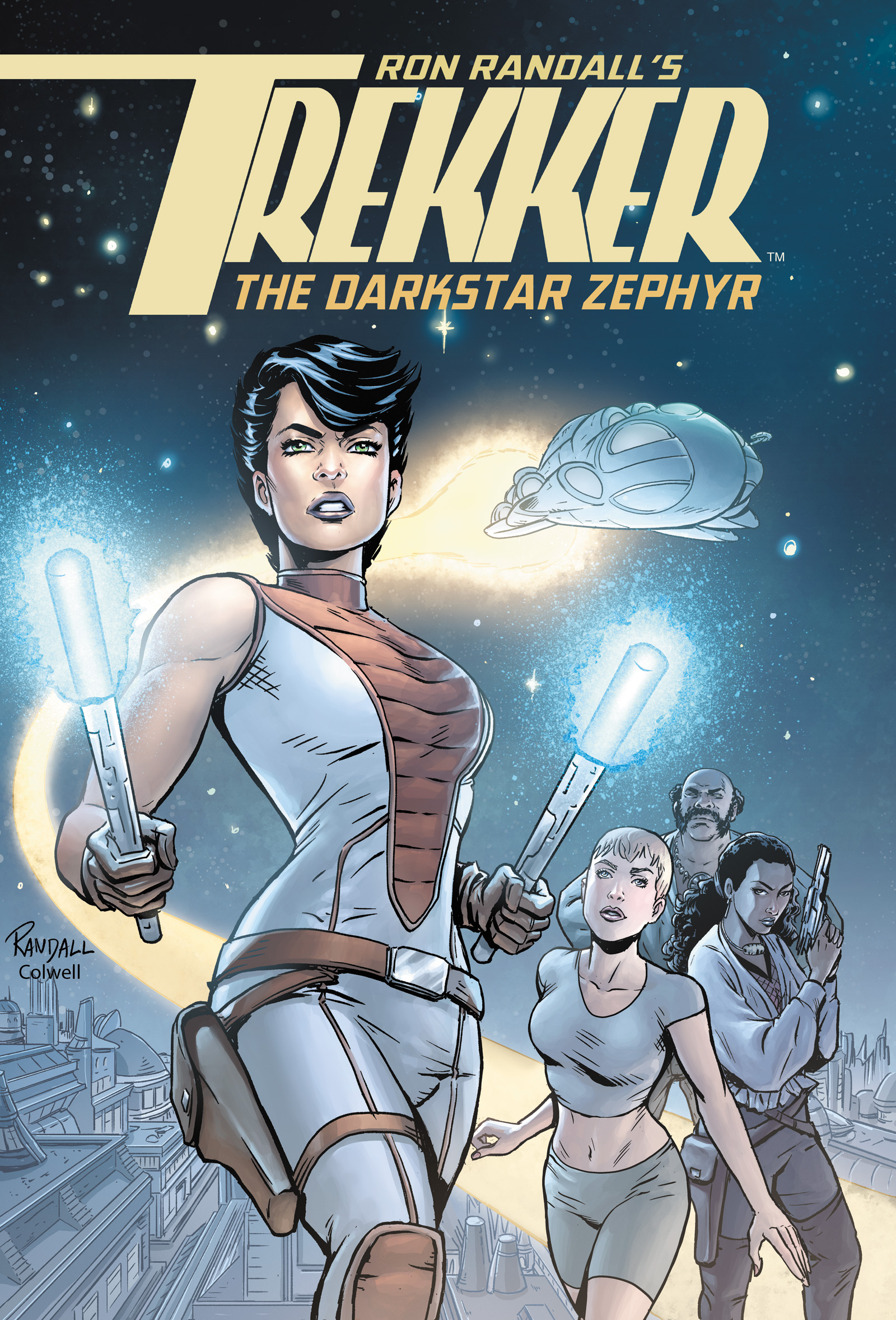
As you can see, the new Trekker tale beginning postings today, “Thicker Than Blood”, returns us to the world of black and white comics, after the great ride of wonderful Jeremy Colwell colors on the previous story “Sins of the Fathers”. Jeremy and I agreed that, given the way I had produced the art for this story, which originally ran in the then-still B&W “Dark Horse Presents”, it made more sense to show it here in that original form. I had worked hard to make these stories look complete in black and white, and we felt putting color even as deft and subtle as Jeremy’s, on top of that would be extraneous in this case. I hope you’ll agree. In any case, more of Jeremy’s great color work will be coming a bit down the road. So hopefully we’ll hit a nice balance of looks to keep things fun and fresh.
A note or two about Trekker in black and white: Back in the earliest of the stories, I was working hard to achieve anything like a fully-finished look in black and white. If you go back to those stories, you’ll see a LOT of shades of gray, and a lot of different patterns and textures. It was a time-consuming process. And while I tried to “control” things, it often seemed unnecessarily complicated if not cluttered. As the stories went on I streamlined, or disciplined, my approach. Some of the later black and white stories used very little gray tone patterns at all. I was experimenting and searching for a look that I could settle into.
“Thicker Than Blood” is another of those experiments. Or actually, it’s TWO different experiments. For the first eight-page chapter, I restrict myself to using only one gray value, one which I applied with sheets of the now-defunct process called zip-a-tone. It was a fine challenge to approach the work this way. You can judge the results for yourself as these next eight pages post. After that, I made a (hopefully) subtle shift in the process. We’ll get in to that when those pages come up for posting.




 AL WILLIAMSON
 JEREMY COLWELL
 JOE KUBERT
 MARK SCHULTZ
 PAUL CHADWICK
 PERISCOPE STUDIO
 RonRandall.com
 THOMAS YEATES
 FAMILY MAN
 MAD GENIUS COMICS
 PERILS ON PLANET X
 QUANTUM VIBE
 THE LAST DIPLOMAT
 THRILLBENT
 TRANSPOSE OPERATOR
Discussion ¬