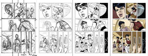
Following last week’s long post where I did an overview of the creation of the current Jekka story, here is a four-step sequence of the stages this week’s page went through, accompanied by some more detailed thoughts on some of the work behind making this specific page. For me, 90% of my primary job as an artist is the Storyteller, and that work happens at the thumbnail stage, which is barely more that scribbles of circles and gestures to block in the elements of each panel. But behind the scribbles is all the thinking and planning: the act of selection which makes a story work visually and dramatically, or not work. Choosing the shot– the angle of the “camera”, the distance from the subject, the specific elements shown in each shot and their relationship to one another. The choices are all dictated by a combination of my instinct for what will make a particular moment clear and compelling (the two essential considerations as a visual storyteller) along with what makes sense within the context of the panels surrounding each other, the page, and the over-all story. A couple of the panels on this page are simple illustrations of this process.
The thumbnail for panel one above shows Mercy’s full head with a suggestion of neck and shoulder. I tilted the angel of the figure and came up with a fairly solid composition that looked good to my eye and kept the story moving along. But, the previous page ends on a tight, cropped shot of Jekka, and to pull back here, in the middle of an intense exchange between the two characters, would feel like a release of dramatic pressure, just at the time when it should be dialed to a climax. So, in the pencils, I pulled in closer to Mercy’s face and kept the focus on her emotion. Also, I knew that following this beat, I would be pulling back to longer shots of the two characters and continuing to include details of the room in the background both for visual interest and to create for the reader a believable environment for the story to unfold within. So, a dramatic close-up in panel one also suggested itself for variety of scale on the page.
I also made the choice to change panel three from a two-shot of the characters to an exterior shot of the ship. Within the context of the dialog, this made sense, as Mercy is here saying to Jekka that she wouldn’t survive the trip without Mercy’s protection. And pulling back to a shot of the cold, impersonal “world outside” seems to reinforce the point. Also, I had not yet shown the ship underway, having stayed with the characters making their way to their rooms as the ship left the station. So I wanted to establish that here without getting in the way of the dramatic exchange between the characters. I knew I would show the ship again in space in the last panel of the page, but that shot is intended to convey a certain tone as counterpoint to Mercy’s decision. And I didn’t want to distract from that by having the panel also serve as the first image of the ship under way.
Lots of these small, critical choices are made on each page. (The downshot in panel two, which both clearly shows Mercy’s gesture of pointing to the door and also, being drawn from a somewhat detached, over-head angle, serves to touch that tone of the implacable, impersonal forces that wait for our heroes beyond that door. Or shooting panel four from behind Mercy’s muscular arm and shoulder-holstered pistol, framing the vulnerable and over-matched young girl so that Jekka’s eventual resolve in standing up to the pressure of Mercy’s interrogation feels like a real act of courage.) Choices which, I hope all work to serve the story well.
It’s a puzzle-solving process, over and over again. One I find completely engaging and rewarding when I strike upon a solution that really works. That’s what keeps me coming back to the board with enthusiasm to do the best I can in chronicling Mercy’s journey.








 AL WILLIAMSON
 JEREMY COLWELL
 JOE KUBERT
 MARK SCHULTZ
 PAUL CHADWICK
 PERISCOPE STUDIO
 RonRandall.com
 THOMAS YEATES
 FAMILY MAN
 MAD GENIUS COMICS
 PERILS ON PLANET X
 QUANTUM VIBE
 THE LAST DIPLOMAT
 THRILLBENT
 TRANSPOSE OPERATOR