Storytelling with Color: the process for this week’s page
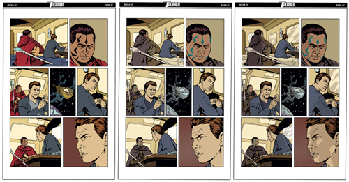 The work of coloring a page can be extremely simple and straight-forward, or very complex and technically involved. With digital coloring, there are a nearly infinite variety of options available to the colorist for color choices, lighting and effects. Color is a crucial element to any page and can profoundly contribute to or detract from the intended tone of the story. Just as with the writing, layout and drawing of a tale, color at its best is an integral element of storytelling.
Color evokes a strong emotional response in the reader, whether consciously or otherwise. So an awareness of the intended tone of a scene is essential for proper color choice. Adding “effects” for lighting, rendering and texture may be pleasant embellishments or disastrous distractions, but the majority of color’s effect on a scene is achieved with color choice. Different color “palates” are appropriate for a lighthearted fantasy, a breezy romance, a super-hero epic, or a gritty crime drama.
In Trekker’s case, I am lucky to be working with Caitlin Like, a gifted cartoonist in her own right and also an accomplished color “flatter” who helps me make choices that fit the series wonderfully. Not to get too technical about it here, Caitlin gets the inked pages from me and assigns an initial color to each discrete area. It’s a step that requires both attention and precision in selecting each area, and also creative awareness to make a color choice that fits the scene and the story. As you can see above, many of Caitlin’s initial choices make it to the finished page.
The second image above shows my “adjusted” colors, where for one reason or another I have made some color changes. Most notable on this page being the cloak on the guide, Wisuu. Cait chose a strong red, which clearly “tags” the character, and gives the scene a nice, bold tone. Why change it? Well, a few reasons. One,we’d already assigned Mercy a red top, and I want to stick to a solid rule I learned long ago of keeping your main character in a unique color scheme. Mercy’s the “star”– and I want her to always be readily seen as such. That’s storytelling clarity. Two, while bright, colorful costumes are a good fit for a superhero tale, I want Trekker’s world to feel more believable, more familiar. That calls for characters that seem both in their appearance and their actions to fit into a world that we could also inhabit. Then, they can be contrasted against the– literally– otherworldly settings and situations they will find themselves in. Three, our characters are trying to move through this journey with low visibility, and having their guide dressed in quiet tones seems to fit that reality better than dressing him in bold primary colors. So again, all my reasons for this color choice are affected by the priority of Telling the Story.
The third image shows the rather modest amount of shading and effects I used to finish this page. Primarily, that is a couple of shading values to do some basic lighting and modeling of forms. For most pages, this level of clean, reality-based color serves Trekker well. Other scenes may include more “effects”– glows from explosions, textures on gritty buildings or organic surfaces and the like, and bolder color choices if the scene calls for a loud and dramatic tone. But I always aim for the color to be sublimated to a supporting role in the art, not to stand out or distract from the action, but rather to support the sense that this is a believable world for the drama of the story to unfold within and to compliment the storytelling of each scene. For Trekker to work, I need all the elements of the story to be working together.









 AL WILLIAMSON
 JEREMY COLWELL
 JOE KUBERT
 MARK SCHULTZ
 PAUL CHADWICK
 PERISCOPE STUDIO
 RonRandall.com
 THOMAS YEATES
 FAMILY MAN
 MAD GENIUS COMICS
 PERILS ON PLANET X
 QUANTUM VIBE
 THE LAST DIPLOMAT
 THRILLBENT
 TRANSPOSE OPERATOR